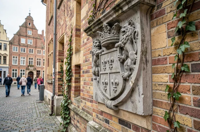
The silver fleur-de-lis on a field of gules has been the official blazon of Lille since the Middle Ages. This heraldic symbol, far from being a mere ornament, carries a symbolic weight that has transcended political regimes, territorial affiliations, and administrative reorganizations without ever disappearing from the visual landscape of Lille.
Technical blazon of Lille: heraldic reading of the fleur-de-lis
The blazon reads “de gueules à la fleur de lys d’argent”. In heraldic terms, “gueules” refers to red, and “argent” to white. The composition is remarkably sober among the coats of arms of major French cities: a single symbol, no partition, no supporters or external ornamentation in its primitive form.
This simplicity is not insignificant. It reflects an ancient attribution, predating the complexities of municipal blazonry that became widespread from the 16th century. The Lille fleur-de-lis does not directly refer to French royalty. Its origin is linked to the Counts of Flanders and the municipal autonomy granted to the city.
We observe that the confusion between royal fleur-de-lis and municipal fleur-de-lis persists in most popular articles. The distinction is, however, structural: the Lille fleur-de-lis precedes the widespread Capetian usage and belongs to a Flemish heraldic tradition. It is this lineage that explains why the blazon survived the Revolution without being systematically destroyed, unlike the fleur-de-lis arms of many cities directly associated with the crown.
To delve deeper into the lineage between municipal coats of arms and contemporary visual identity, the blazon and logo of Lille traces the steps of this transition from heraldic symbol to institutional logotype.

Lille fleur-de-lis and LOSC logo: an assumed heraldic transfer
LOSC, founded in September 1944, incorporated the fleur-de-lis into its visual identity from its early years. The link between the municipal blazon and the sports emblem is not automatic in France: many historic clubs use animals, initials, or geometric shapes unrelated to their city’s arms.
In Lille, the choice is different. The fleur-de-lis has remained the pivot of every redesign of the LOSC logo, from the first badge of the 1940s to the current coat of arms adopted in 2018. The club’s red and white colors directly reflect the tinctures of the municipal blazon (gueules and argent).
The 2018 logo marked a formal break: the abandonment of the oval cartouche, a return to a more classic shield, and modernized typography. The fleur-de-lis occupies a central position, flanked by the dogue, the club’s mascot. This choice to overlap two symbols (one municipal, the other sporting) within the same shield creates a hybrid heraldic object, neither purely municipal nor purely sporting.
The away jersey 2026-2027 and the reactivation of the 1989-1997 blazon
Since the summer of 2026, LOSC and New Balance have unveiled an away jersey reintroducing the logo used between 1989 and 1997, from the Grimonprez-Jooris era. Buttoned collar, geometric patterns, blue and red trims: the design embraces a 1990s aesthetic.
This strategy of reactivating old blazons goes beyond mere nostalgic exercise. It aims for a generational reconnection with supporters who experienced that period, while providing the club with a lever for commercial differentiation against the standardized jerseys of Ligue 1.
Red fleur-de-lis on the third jersey: the bridge between city and club
The third jersey 2026-2027, unveiled in August 2026, pushes the logic further. Against a midnight blue background, a red fleur-de-lis appears at the neckline, on the sides, and at the center of the coat of arms. LOSC has explicitly presented this fleur-de-lis as an “identity element of LOSC and the city of Lille.”
This official statement is significant. It marks the first time the club publicly acknowledges and in its communication materials the dual belonging of the fleur-de-lis: a municipal heraldic symbol and a marker of sporting identity. Until then, the lineage existed in fact but was not claimed with such clarity.
- The silver fleur-de-lis on gules remains the official blazon of the city, unchanged since the Middle Ages
- LOSC has used this fleur-de-lis as a central element of every version of its logo since 1944
- The 2026-2027 jerseys incorporate the fleur-de-lis not just in the coat of arms, but as a full textile motif
- The red and white of the club correspond to the heraldic tinctures of the municipal blazon (gueules and argent)
Flags and urban display: the Lille coat of arms in public space
Lille is one of the few French metropolises to maintain a flag-type display in its streets. These vertical banners feature the colors and fleur-de-lis of the coat of arms, creating a visual continuity between medieval heraldry and contemporary urban furniture.
This choice of display is not cosmetic. It is part of a territorial marking strategy where the coat of arms plays a role as a visual signature, akin to an institutional logo. The city uses the fleur-de-lis as a connector between its various communication materials: signage, administrative documents, cultural events.
The persistence of this heraldic usage in public space distinguishes Lille from many cities that have relegated their coats of arms to a purely protocol role. In Lille, the coat of arms remains a tool for active communication, not a relic framed in a municipal office.
This continuity between ancient heraldry and modern visual identity explains why the Lille fleur-de-lis can be found on both the LOSC jerseys and the flags of Vieux-Lille. The heraldic symbol has changed its medium, not its function: it identifies a territory and unites a community, whether municipal or sporting.